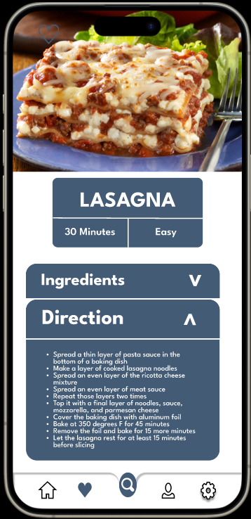
Project 01: Redesigning Existing UX
Team:Fransiskus Aldo, Shima Deljavan Farshi
Introduction:
This report discusses our plan to make a previous project created for the Dynamic Web Programming course more attractive and user-friendly. You can visit the project website by click here.
Current State Analysis
We will thoroughly examine the existing design of 'Cuisine Jackpot,' focusing on its drawbacks, difficulties, and user-experience issues. This analysis will guide our comprehensive and user-oriented redesign.
Responsive Design:
Our goal is to create a design that performs well on different mobile devices and screen sizes, ensuring the best user experience and performance.
User Research and Feedback:
We conducted user research and feedback to identify the target audience, their needs, and their pain points. This analysis will help us create a user-friendly and visually appealing design.
During our user research and feedback gathering phase, we received valuable insights that have shaped our redesign strategy. Users expressed dissatisfaction with several aspects of the current design, and their feedback can be summarized as follows:
Color Preferences: Users conveyed a dislike for the current color scheme used in the interface. They found it unappealing and not visually engaging.
Font Preferences: Users expressed concern about the font used in the interface. They found it to be too large and not legible.
Accessibility: Users expressed a need for improved accessibility features in the interface. They found it difficult to navigate and understood.
Usability: Users expressed a need for improved usability features in the interface. They found it difficult to use.
Scrolling Issues:Users expressed frustration with the need for excessive scrolling to access content, which they found inconvenient and time-consuming.
Button Placement:Feedback highlighted that the placement of certain buttons was not intuitive, leading to confusion and difficulty in executing actions.
